

Photo credit: Brandi Redd via flickr, CC BY-ND 2.0
“Opportunity” is the new, ubiquitous catchword of contemporary housing policy today—as in “geography of opportunity,” “opportunity neighborhoods,” “opportunity mapping,” and no doubt many others. We have converted the word from a noun into an adjective; opportunity is now a place—to be precise, it is a type of neighborhood: one that among its many assets is rich in amenities, free from environmental and social hazards, and graced with good schools. In short, it is the kind of place that increases one’s chances for upward mobility.
As with many catchwords, however, it is prone to misuse and is sometimes invoked in ways that are sloppy and ill-conceived. If we are truly going to reduce our housing policy objectives to the realm of goals related to “opportunity” (a topic that deserves separate consideration) I would like to offer some guidelines for its proper use.
There are at least three ways in which this concept is commonly misused by policymakers, analysts, and advocates. The first is to measure the existence of opportunity by looking at who lives where.
Think, for example, of the MTO program or the Gautreaux mobility program. Though practices have changed over time, in those programs, as in most all mobility programs, “opportunity neighborhoods” are defined as places where few poor people live and/or few people of color. If there is a utility to the concept of “opportunity neighborhoods” it would be to identify areas that offer advantages to people so that, presumably, policymakers, planners, and advocates can then determine which groups have the greatest or least access to them. In the early days of opportunity mapping, however, it was standard to simply map race and/or poverty and call low-poverty or predominantly white neighborhoods “opportunity” areas (it is still possible to find so-called opportunity maps that are simply maps of race and/or poverty).
Sometimes other characteristics, such as welfare use or female-headed household status, are used. Regardless, such practices confuse the idea of a geography of opportunity with the geography of people. This, of course, defeats the purpose of opportunity mapping in the first place, as such maps don’t illuminate anything about who lives near opportunity, they assume it. In addition, such maps problematize certain groups (people of color, the poor) while valorizing others (whites, the affluent).
The message that these maps convey is that communities of color and lower-income neighborhoods lack value, an idea we should have left behind years ago. This type of “opportunity mapping” is simply old-fashioned demographic mapping that tells us little about where opportunity resides. It is a way to make a map about race without calling it a map of race, and it is no innovation at all.
The second mistake is in treating opportunity as a binary phenomenon. When you are shown a map of “opportunity neighborhoods” that divides a city or metro area into “have” and “have not” areas, be wary. We know the world doesn’t work like that, and that neighborhoods simultaneously embody many different and often contrasting realities. Opportunity maps that purport to summarize urban neighborhoods in a single dichotomy obscure much more than they reveal.
The third mistake is to think and act as though opportunity exists along a single dimension. There is, for example, the opportunity that is provided by good schools. There is also the opportunity that is afforded by proximity to jobs, or by the lack of crime, or by access to transit and other transportation infrastructure, among others. This is not a particularly controversial assertion, and many opportunity mapping exercises now incorporate multiple measures of opportunity. The more dimensions of opportunity that we identify and map, the better.

The problem arises when we collapse these different dimensions into a single index of opportunity, map that index, and then present that result in an opportunity map. This last step is almost irresistible to those who may want (or need) an easily digestible summary from which to work, but doing so fails us in many ways.
Most importantly, the different dimensions of opportunity almost always have different geographies. The geography of transit access typically doesn’t match the geography of high-performing schools. The geography of jobs in most metro areas is different than the geography of environmental hazard. The geography of crime doesn’t always match up with the geography of safety (if one includes traffic death/injury in the measure, for example). Each of these dimensions of opportunity plays out differently in our metropolitan areas. A single index of opportunity forfeits all of this information and produces a single map that means much less than any of the individual maps that it subsumes.
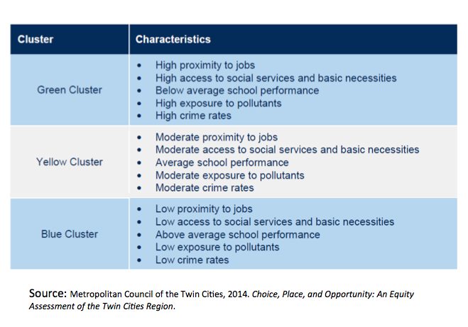
Figure 1. Source: Metropolitan Council of the Twin Cities, 2014
A single index also forces us, at the mapping stage, to judge the relative importance of each of the individual dimensions. How do we weight these different dimensions? The default assumption is that they are all of equal importance, but we know that this is probably not the case for any group of people within a metro area. Schools are less relevant to the childless, transit less relevant to those with automobiles, and jobs less relevant to seniors. The weighting of the different dimensions of opportunity is best left to the consumers of opportunity maps (advocates, activists, policymakers), not the producers. An index necessarily relies on the analyst’s judgment of the relative importance of the different dimensions and produces a geography of opportunity that incorporates that judgment. The rationale for that judgment is almost never revealed and would be difficult to defend if it were.
We, instead, need to begin thinking about a matrix of opportunity in urban neighborhoods, or about neighborhoods reflecting different clusters of opportunity. In the first case, we array neighborhoods on one axis and the dimensions of opportunity on the other. Each cell contains an assessment of the degree of that type of opportunity that is in each neighborhood. (See figure 1) This would allow planners and policymakers to match interventions more closely to the neighborhoods that may need them.
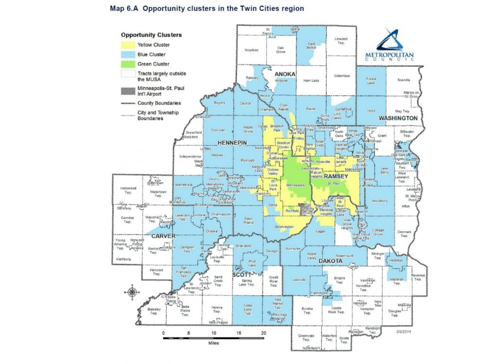 In the case of clusters, we can apply a principal component or factor analysis to the data to identify the ways in which different types of opportunities co-vary, and so identify and map neighborhoods according to the dimensions of opportunity that they bundle. And so, one might typically find neighborhoods that are rich in transit service are proximate to large numbers of jobs. Other clusters may have high values related to school quality, low transit service, and few environmental hazards. Any number of combinations is possible, but a statistical analysis of the different geographies of opportunity could bring these clusters to light.
Opportunity mapping should be a way of illuminating relevant spatial dynamics in metropolitan areas. The next time you encounter an opportunity map, or a discussion of opportunity neighborhoods (if you are a professional in this field, it won’t be a long wait) apply these guidelines. If what you are hearing or reading does not meet them, chances are high that important realities are being obscured or simplified. If it is something you are reading, stop reading—you are wasting your time. If it is something you are hearing, raise your hand, ask the speaker to stop wasting your time, and suggest better ways to address the issue of opportunity neighborhoods. Politely, of course.


I think you make an important observation here about the dangers of being the judge of opportunity, or lack thereof. In fact, I think this practice you criticize of analyzing data for others’ good is prevalent across planning and related disciplines: we grade our streets based on the level of congestion, as if more congestion is a sign that the street has failed; we zone properties down to the most minute detail, allowing the uninformed/most invested to determine what is “compatible” with other properties; and we use some of the data you mention to (sometimes incorrectly) determine whether a neighborhood is “gentrifying” or not.
Perhaps more important, though, is the idea that it’s easier to move people that are minority or lower-income to “areas of opportunity” than it is to make their current neighborhoods places of opportunity themselves. Why not focus on transforming the lower-performing schools? Why not incentivize job growth in areas that have been traditionally disinvested? Why not spend the money to clean up the pollutants from where people are living? Why not create a built environment that works well at preventing crime before it happens? Why not ensure these neighborhoods have quality transit access?
I’m with you on your last set of questions. Too often the ‘opportunity’ framework is used to support a mobility approach but in fact it just as easily supports a community development approach.
Thoughtful piece Ed. Especially liked the warning about creating combined measures of “opportunity” and the point about the different geographic scales of access (schools vs transit e.g.) that are often ignored. Differences across and even within metros and cities are often really large too. A search for simplicity and uniformity can be fatal here.
I appreciate this analysis. As part of our programing we are supposed to be encouraging participants (primarily low-income persons of color) to live in “areas of opportunity.” Access to transportation and proximity to their individual service needs is not typically part of the consideration in the opportunity maps or are very diluted among other factors, and yet beyond safe, affordable housing, those items are typically most important for the participants (in addition to schools for those with children). Of course, every household is different, but these broadly are the priorities.
Not to mention, there is currently no law or standard that compels landlords to rent to subsidy program participants so even if we along with the participants locate areas in which they would like to live which are considered higher opportunity areas and they have the rent support, we find most places deny access as they are “no Section 8.” While Fair Housing laws are supposed to be supporting choice, the people we serve rarely have much choice in where they reside because so much of the available rental housing is not available for persons with housing subsidies.
I share the concerns that this focus on opportunity will allow sustained disinvestment in low-income and/or areas with large non-white populations instead of supporting those neighborhoods to support and invest in the strengths that they have, which could include affordable housing, transit networks, proximity to certain job clusters, access to institutions (higher ed, hospitals, government services) and/or rich neighborhood/cultural histories.
Any tips on how we can use the current opportunity maps or systems in a more positive or personalized way? Or should we wait until there are systems (free?) where participants could select the most important priorities for themselves and their families and then identify some areas to focus on a housing search?
I think you have identified a very promising use for these types of analyses – to make them interactive and allow people to easily see the distribution of the types of ‘opportunities’ that are most relevant and meaningful for them. Perhaps someone/someplace is starting to do this?
Ed – With the matrix approach, you are offering a valuable alternative to the mapping of high-opportunity areas. There is little doubt that the concept of opportunity mapping has been and is being misused (e.g.: the omission of crime rates due to lack of data; use of environmental indexes that compare regions but cannot be used to compare neighborhoods, etc.) However, the overall concept remains valid. We know that we can break the cycle of poverty in the long term by moving families to areas with high performing schools offering freedom from exposure to crime. Sadly, we also know that voucher holders do not move to high-opportunity areas without incentives. As a result, communities are seeking to incentivize movement to high opportunity areas by voucher households and LIHTC developments. The community development argument is not being abandoned, but after decades of community development investments, we do not have a clear path to success. Most low-opportunity neighborhoods remain low-opportunity neighborhoods.
Kirk, thanks for the comment. I don’t really agree that opportunity mapping must lead to a mobility strategy, though. But most of all I’m trying to argue for a movement away from the binary thinking of high/low opportunity area.
Re: Kirk/Ed broader mobility/place debate, I can’t help myself. I know folks don’t often like this, but I continue to argue that, on the ground, folks are best served by being “both and” opportunists. There are places (neighborhoods) where community development approaches make sense, where the problems are not overwhelming, where there are actually early-warning signs (that far precede “slow” ACS tract or block group data, for example) gentrification that might be mitigated/balanced with place-based affordable housing, and where a “fix” to one, two, or three things (adding bus service, improving a school, e.g.) is feasible. At the same time, improving choices and mobility (esp through things like source-of-income protection laws, transit improvements, etc.) into a broader set of places generally makes sense. And, in general, I have less patience these days (because the evidence has become stronger) with folks (not impugning particular folks) who continue to simply discount what is really overwhelming evidence that, ON AVERAGE, there are sizeable negative effects to concentrated poverty (measured by people, yes, but of course it is really measuring opportunity structures of different kinds). For perhaps the best recent review: https://www.rsfjournal.org/doi/full/10.7758/RSF.2017.3.2.01
The problem for policy and practice is not to just “run with” the “on average” evidence completely and discount all place-based approaches, but rather to find the places where policy and practice can address the specific structural problems effectively. This also doesn’t mean though that mobility approaches should be abandoned.
“Both and” is needed. As theoretically or intellectually unappealing as that may be.
Dan, thanks for the feedback. My feeling is not that “both and” is theoretically/intellectually unappealing, but that it reflects only a long-term alliance. In the short term individual project proposals face up or down votes and in an environment of limited resources, choices are made. I have yet to see/hear a convincing argument that denying an affordable housing development in a low-income neighborhood somehow produces affordable housing in “opportunity” neighborhoods.
So, on one level, of course it is ‘both/and’. We should be doing what we can to break down barriers to affordable housing in white, “opportunity” neighborhoods. And voluntary mobility programs should exist because people who want to exercise that choice ought to be able to. But neither of those should happen at the expense of community development, and more to the point, those who identify community development as part of the problem of concentrated poverty/segregation (either through lawsuits or other means) could better use their time figuring out ways to get housing built in ‘opportunity’ areas.
And, I’m not sure that anyone strongly contests that there are negative effects to the disinvestment, public and private, that accompanies/produces concentrated poverty. But, certainly it is reasonable to contest the idea that mobility is the only or even just the best policy response to it.
Thanks for stimulating this conversation Ed, Kirk, and Dan. I made an almost identical argument in the latest HPD:
https://www.tandfonline.com/doi/full/10.1080/10511482.2017.1331930
it’s possible to (a) develop statistically valid indicators of multiple neighborhood ‘opportunity structures’, (b) use those indicators to identify neighborhoods amenable to certain types of policy interventions, and (c) tailor policy responses that incorporate nuance.
We haven’t seen that done enough.
Great article Eli, and an important contribution to the literature! So glad you wrote it!
Impressive work Eli.
The Ohio Housing Finance Agency hired the Kirwan Institute, which focuses on issues of race and social justice, to map opportunity census tracts in Ohio for the tax credit competition and OHFA has set aside resources for family developments in those areas. The formulas used to map high and very high opportunity, as well as tracts undergoing change, cover all the components (income, schools, jobs, crime, etc.) Prof. Goetz describes and, yet, the results are sometimes surprising. Sure, the affluent areas are pretty much all high opportunity, but some poor areas (QCTs) show up moderate opportunity with a positive change index and I have no idea why the location is viewed as desirable for development. Kirwan rejiggered its formulas from the prior year and now a suburban high opportunity site from last round–where I helped get a project funded–now shows up as a low opportunity site for the 2018 competition. So, all I am saying is that as we create more complex formulas for mapping opportunity, we are bound to find unintended consequences because our communities are so complicated. Sometimes I think that setting aside affordable housing resources for sites in census tracts above the median for the county, with a secondary analysis of locating in underserved markets, would be an adequate way to redistribute housing opportunity. The correlation of higher income and lower existing concentration of targeted housing to race, decent schools, job opportunities, lower crime, etc. is pretty compelling, even if inexact.
Thanks for the note. The fact that a high opportunity site from last round turns into a low opportunity area as a result of a ‘rejiggering’ of the formula highlights a fourth problem with opportunity maps that I didn’t mention – but should have. I am referring to the general lack of sensitivity analysis accompanying opportunity maps. How much do these categories change with slight changes in the formula or slight changes in the value of any of the data elements? If one can slightly rejigger the formula and see a given neighborhood change from high to low then that suggests to me that there might be some problems with the formula or the thresholds used. I think you have identified another best practice for this kind of work.
Thanks for this helpful critique and suggestions for improvement. Our mapping for our Fair Housing Equity Assessment includes a number of the approaches criticized, such as mapping of people’s characteristics, especially race and poverty into areas with high or low “barriers to opportunity.” To some extent this approach is encouraged by HUD through required mapping of Racial/Ethnic Concentrations of Poverty (although I don’t recall that HUD guidelines included applying the opportunity labels). We also mapped a wide range of physical and access characteristics such as parks, jobs, environmental, grocery stores, transportation/transit, etc. As well as health outcomes by block group. It was all there for those who wanted to flip through page after page of maps to study the nuanced picture. But we also produced summary maps that attempted to paint a concise picture. Those, as noted above, diminished the richness of the information. At the same time, the summary maps were far more effective in getting attention and in moving beyond data to, as HUD promoted, deliberation and decision-making. Hopefully, in future efforts, we can achieve both richness of information and impactful messaging. The matrix approach could help with this objective. This will be an ongoing challenge, however, in this age of sound bites and limited attention spans.
Thanks Steve. Yes, HUD is requiring a lot of spatial analysis by local officials, but the agency organizes its requirements, as you note, around the RECAP concept. Hopefully, local efforts can get beyond that by doing the things you described.
I have also witnessed the irresistible urge to simplify/summarize the information via the summary map. I completely agree that this will be an ongoing challenge. But the more attention given to the potential problems associated with that, the better!
Picking up the thread on the both/and vs. either/or debate…
Here are a couple of reasons why a both/and approach to place-based investments has appeal:
–As has been pointed out, different people need/want/do better in different situations. Choice is a good thing. Some people value being in a community that feels comfortable and familiar above all; investing a community development approach might work best. Other people need/want/do better with access to specific assets right away and are willing to give up the comfortable and familiar to do so. Why not offer choices?
–The characteristics of place can (and often does) change during the lifetime of a subsidized development—transit lines can be added or removed, school quality can improve or go downhill or school boundaries can be changed, a new hospital can be built, and so on. Why not hedge our bets for the long term and invest in places representing both community development and so-called access to opportunity?
Well said. I would agree. I just worry about the challenges of operationalizing a both/and strategy since the process is so decentralized and, as a result, uncoordinated in American metro areas. But I think both of your reasons are right on target and compelling.
Great article. from the post…..
“The message that these maps convey is that communities of color and lower-income neighborhoods lack value, an idea we should have left behind years ago. This type of “opportunity mapping” is simply old-fashioned demographic mapping that tells us little about where opportunity resides. It is a way to make a map about race without calling it a map of race, and it is no innovation at all.”
This is important. What the maps don’t say, and what’s important to city leaders is the speculative value of their land base and the rent gap between the current value and what it could get with improvements (in both demographic and the built environment).
So the “race map” sold as an “opportunity map” is really showing a city that if they dilute the population of these areas with majority ethnic minorities (specifically African-Ams and Latinos) they can increase the value (read opportunity) of those areas. Property has a higher potential value when associated with white identity and land uses, whether in residential, social or commercial land uses so cities have an incentive to give preference to land uses that cater to that demographic.
Late to the conversation, but maybe not too late: What about conditions that are arguably so toxic or hazardous that they ought to make some neighborhoods “no fly zones” until the urgent conditions are addressed? It’s easy to think of a few things — imminent risk of flooding, toxic waste — where we already know low-income and vulnerable people worldwide are concentrated. Some people argue that certain neighborhoods are so plagued by violence that the most vulnerable people should be evacuated. (Often, people who have the means will have fled long before things reach this level of trauma.) With mounting evidence of threshold effects, maybe this would add to the practice.
There’s a parallel in environmental suitability mapping — the introduction (at the first step) of binary “no go” criteria — but “no go” in these community development cases really ought to mean “concentrate resources here until hazards are brought to tolerable levels and/or the most vulnerable people are no longer exposed to them.” It’s again not necessarily an either-or, but in some cases the evacuation has to happen first, to prevent immediate and long-term human costs. This is probably the area in which fair-housing and community-development practitioners remain most at odds with each other. The FH observer is more sensitive to the threats from immediate exposures; the CD practitioner is more attentive to the protective relationships that would be undermined in an evacuation and the harms that could accrue in the relocation site. We might benefit, and act with more appropriate urgency, if we reframed our conversations in such cases as being about “harm reduction” rather than “access to opportunity.”