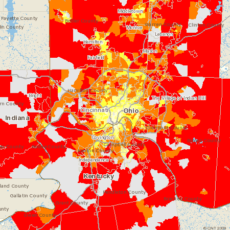
The Center for Neighborhood Technology is releasing today a new series of GIS-based maps showing where carbon emissions from driving are the highest in the nation’s metro areas. The maps demonstrate vividly that, although emissions on a per-acre basis are greatest in highly urban areas, it is in the suburbs and outlying areas where we pollute the most on a per-household basis. This is because rates of driving are so much higher in spread-out suburban areas than in places where homes, jobs, shops, and services are in more convenient proximity to each other.
For example, the site contains two maps of each region. The first map displays emissions per acre, and shows that the areas with the highest emissions, in red, are those that are most heavily populated. That much should not be surprising. But the map changes dramatically when carbon emissions are plotted on a per-household basis, as shown on a second map. (See the one of greater Cincinnati accompanying this post.) It shows that the most populated areas actually have the lowest pollution rates per household. This is yet another argument for why proponents of sustainability need to prioritize revitalization and infill over suburban expansion.
There are maps of 55 metro regions in all, and CNT promises that they will have 330 regions mapped and accessible later this year. Go here for more illustrations and links.


Comments