In my most recent post we started a conversation about some of the differences between very large cultural organizations and, well, everybody else. I pointed out that members of the Cultural Institutions Group (CIG) tend to be concentrated in the upper bracket. I also said that, frankly, there should be further research conducted on how income streams and strategies vary based on whether or not an organization is a member of the CIG. (For a powerful statement on funding inequity in the arts, check out this report from the National Committee for Responsive Philanthropy.)
But while being a member of the CIG may make you privileged, it doesn't make you evil. I think that good policy comes out of an informed debate about our resources and our choices in using those resources. We’ve got all this lovely data, so let’s use it to analyze the assumptions underlying the present system. Assumptions we can analyze, assess and alter—or not—based on our current, best understanding.
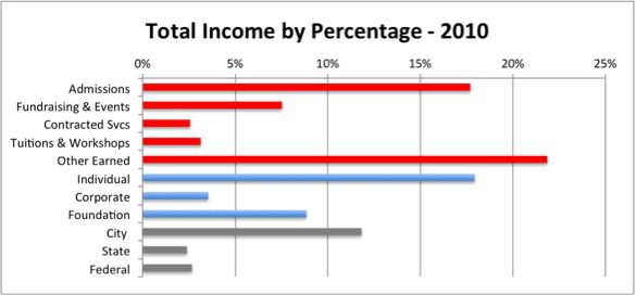
So, let’s look at another juicy issue. In our last episode, our hero was pondering the following chart:
This picture tells us a number of interesting things:
- The red bars indicate earned revenues as a percentage of total income. Earned revenues make up over half of all income.
- The blue bars indicate philanthropic support raised. Grants and gifts account for 30 percent of all income.
- The grey bars show public sector funding. This accounts for the remaining 17 percent.
As you may imagine, these percentages can vary significantly depending on variables like organizational size, creative discipline, geography, audiences served, and so forth. There are lots of interesting ways to parse this data, but for today I want to focus on one particular bar: Other Earned Revenues.
Why? Well, because it's the biggest, and it's also the most vague. A lot of things get tossed into the gutbucket of Other Earned Revenues, and I found the disaggregation most interesting.
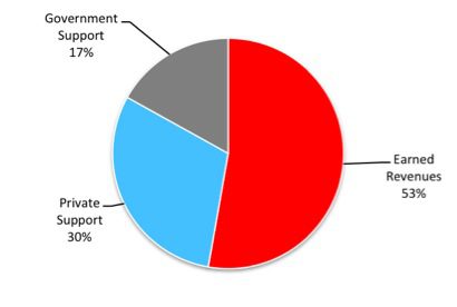
First, a bit more context. As the pie chart below shows, on average nonprofit cultural groups in this city generate most of their annual income from money they earn—not from grants or public subsidy.
Why is this a big deal? Because that makes pretty much all arts organizations an outlier among their nonprofit peers, whose earned revenues tend to be a much smaller percentage of their overall income. Intuitively this makes sense: if you’re operating a domestic violence shelter or a job development program, people aren’t paying you to come and see what you do. Arts groups have audiences, and audiences buy tickets. And there are all kinds of other clever ways that arts groups are self-subsidizing their work (as we’ll see below). I just think it’s interesting that we as a culture experience a lot of agita with our relationship to funding the arts, when essentially the arts operates far more efficiently from a leveraged dollar perspective than the rest of the nonprofit sector.
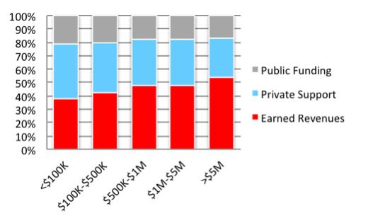
As you can imagine, earned revenues vary significantly by total organizational income. And that variance is quite large: the very smallest income category (less than $100K in annual income) had about $45 thousand total income on average, while the very largest (more than $5 million in annual income) had more like $32 million (Again, notice the skew issue? The few very large organizations drag this average quite high indeed). These variations in scale are eye-popping. Note that on average earned revenues for the very largest organizations were roughly 1,000 times greater per year than the very smallest. Charming.
As you can see from the charts below, this has a big impact on the strategy that an organization uses to raise its money. Smaller nonprofit culturals tend to rely more on private support than earned revenues, while larger organizations do the opposite. What’s more, it appears that the larger the organization becomes, the more it’s able to generate earned revenues to increase its total income—a kind of “virtuous cycle,” at least as far as pulling in cash goes. Interestingly, the percentage of support from the public sector remains relatively flat, varying just a few points between the very smallest and largest.
So, the bigger you are, the easier it is to earn money. But how? Increased ticket sales? T-shirts and key chains selling like hotcakes?
That’s why it’s so interesting to look at the Other Earned Revenue category in greater detail. While it would be useful to dig through each income stream and compare them by size, this is just a blog and I’m trying to keep this under 1,000 words. And besides, here we have this lovely category that provides us with that fractal view, that piece which mirrors the whole.
But what is Other Earned Revenue? If it’s not ticket sales, events, contracted services (mostly for educational programs) or workshops and programs, what else is bringing in all that cash? Let’s have a look.
As you can see, “Other Earned Revenue” is made up of 13 subcategories, with the top three overall being “Miscellaneous,” “Merchandising,” and “Rentals.” (“Miscellaneous,” by they way, is a catch-all category that, to my eye, includes a great many improperly coded revenues including gains and losses on investments, reimbursements, and licensing fees. Many of these could probably be cleaned up and better fit into existing categories, but that’s for another post on the challenges of working with Cultural Data Project data.)
But look at that variation: look at how much comes from Rentals and Tours for the very smallest groups—over 40 percent! And look how much comes from Gift Shop sales for the very largest—28 percent!
This chart tells us so much at a glance. For instance, large groups appear able to monetize their brand through merchandising, and their rentals are more likely to be for events and special performances by people seeking a high-end venue. Smaller groups, on the other hand, are probably relying on developing new work and renting out their facilities during off hours to other culturals. These are very different strategies indeed, and the fact that we can measure this activity across a pretty big group of nonprofit culturals gives us a darn strong indication it’s a fairly common characteristic.
I think we should be using data like this to shape how we spend our money—whether those funds are philanthropic, public, or private. So stay tuned! In my next post, we’ll be discussing the implications of this research and the possible applications for funding policy.


Comments