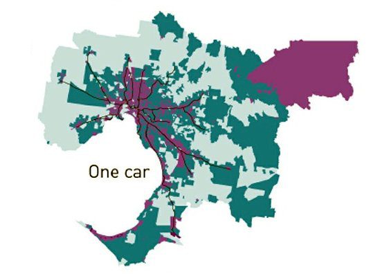
GIS mapping in Melbourne, Australia, on patterns of car ownership shows that transit works: the closer one is to a rail transit line, the less need there is for a car. The farther away, the greater the need for multiple cars. In the image accompanying this post, the purple areas – where 50% or more households own no cars or only one – track the area’s rail transit lines. In the dark green areas, which extend from the transit lines, 20-40% of households own no cars or only one.
For more maps, including those tracking two- and three-car households, and some explanation of how they were derived, go here.


Comments