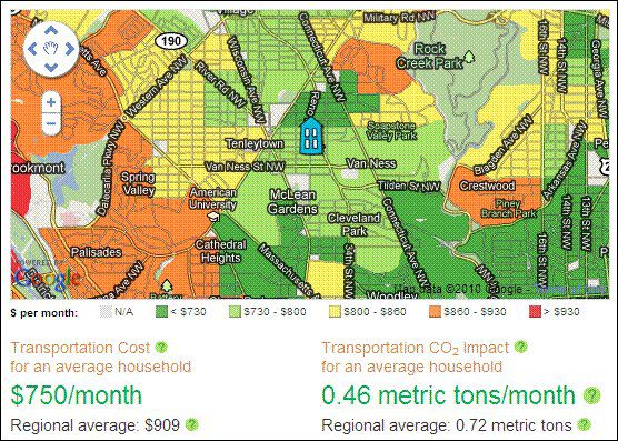
The latest in the snazzy series of useful tools and research on housing and transportation costs published by the Center for Neighborhood Technology is called Abogo. It works like Walk Score: you enter an address and the site produces a GIS-coded map and data for that address, including the average amount of monthly spending per household for transportation in the address’s neighborhood and the average monthly amount of carbon emissions per household for transportation, in both cases compared to regional averages.
CNT explains its methodology including, in part, the following:
“We estimate total transportation costs for an average household from your region living in your neighborhood, including commuting, errands, and all the other trips around town. We count money spent on car ownership and use, as well as public transit use. For CO2 emissions, we count car use only. We use data from the Housing + Transportation Affordability Index, a project of the Center for Neighborhood Technology.”
On my NRDC blog, I show not only the map and info for my house, which you see here – our location is below the regional average in both costs and emissions – but also for NRDC’s office neighborhood in DC and for my sister-in-law’s location in an outer suburb. Because of greater regional accessibility, we would expect the downtown location to perform best and the outer suburb to perform worst. That’s exactly the case. Check it out, here.
Well done, CNT. Go here to try Abogo for yourself and for more information.


Comments