The Urban Land Institute has produced a remarkable report that examines in depth how where we live affects how much we drive, and consequently how much we must spend on transportation and housing.
The illustration is the Washington, DC area, but the same patterns apply almost everywhere. The report (follow the links below) contains lots of GIS-based maps that are fascinating for a wonk like myself.
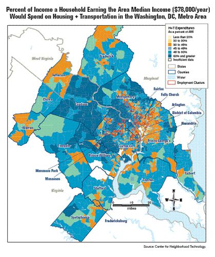
Basically, as previous reports from the Center for Neighborhood Technology (which partnered in the new report, along with the Center for Housing Policy) have demonstrated, the farther away one gets from jobs and the traditional center of a region, the more one has to drive, and the more one has to spend to do so. As one moves farther out, average driving costs actually overtake housing costs in their proportional claim on household income. Although average housing costs may decline, the apparent savings to the household are wiped out by the increased transportation costs, so that true affordability becomes elusive.
I’ve produced two blog posts over at my home blogging base at NRDC that discuss the report in some detail, with maps and links. I won’t attempt to reproduce them here, but the first summarizes the data-rich ULI report, and shows how the apparent affordability of locations changes when driving costs are counted.
The second was a bit more fun for me: in conjunction with the report, ULI’s Web site hosts a “housing + transportation cost calculator” that lets you plug an address in and get all sorts of interesting information about the location back about transit access, average driving rates, average housing costs, average transportation costs, and so on.
As it happens, my wife is from this area and we have several households we can compare. So I used the calculator and Google Earth to map our own house and three others belonging to extended family members, and let the calculator do its thing. The results are telling.
If this sounds interesting, please take a look and leave a comment if you like.


Comments